🎉 Start Shopify’s $1 Plan and We’ll pay you up to $3,600 just for starting! 💸 — Limited Time
Get Limited Time Offer 💰
Offer Details — Rewards require completing eligible third-party offers. Reward amounts vary from $30 to $3,600. Terms and eligibility restrictions apply.
🎉 Start Shopify’s $1 Plan and We’ll pay you up to $3,600 just for starting! 💸 — Limited Time
Get Limited Time Offer 💰
Offer Details — Rewards require completing eligible third-party offers. Reward amounts vary from $30 to $3,600. Terms and eligibility restrictions apply.
🎉 Start Shopify’s $1 Plan and We’ll pay you up to $3,600 just for starting! 💸 — Limited Time
Get Limited Time Offer 💰
Offer Details — Rewards require completing eligible third-party offers. Reward amounts vary from $30 to $3,600. Terms and eligibility restrictions apply.
Ecommerce Strategies
Why Mobile-First Design Boosts Dropshipping Sales
Why Mobile-First Design Boosts Dropshipping Sales

Your dropshipping store might be losing sales right now. Why? Because over 70% of e-commerce traffic comes from mobile devices, yet many stores fail to prioritize mobile users. Poor mobile design leads to abandoned carts, lower search rankings, and frustrated shoppers.
Here’s what you need to know:
Mobile drives sales: 66% of Shopify’s Black Friday sales came from mobile.
Google ranks mobile first: A slow or clunky mobile site can hurt your visibility.
Speed matters: A 1-second delay reduces conversions by 20%.
Bad navigation kills sales: 61% of users leave sites that aren’t mobile-friendly.
Mobile-first design solves these issues by focusing on fast load times, simple navigation, and touch-friendly layouts. Platforms like BuildMyStores make it easy to create mobile-ready Shopify stores in minutes, helping you tap into the growing mobile audience and boost sales.
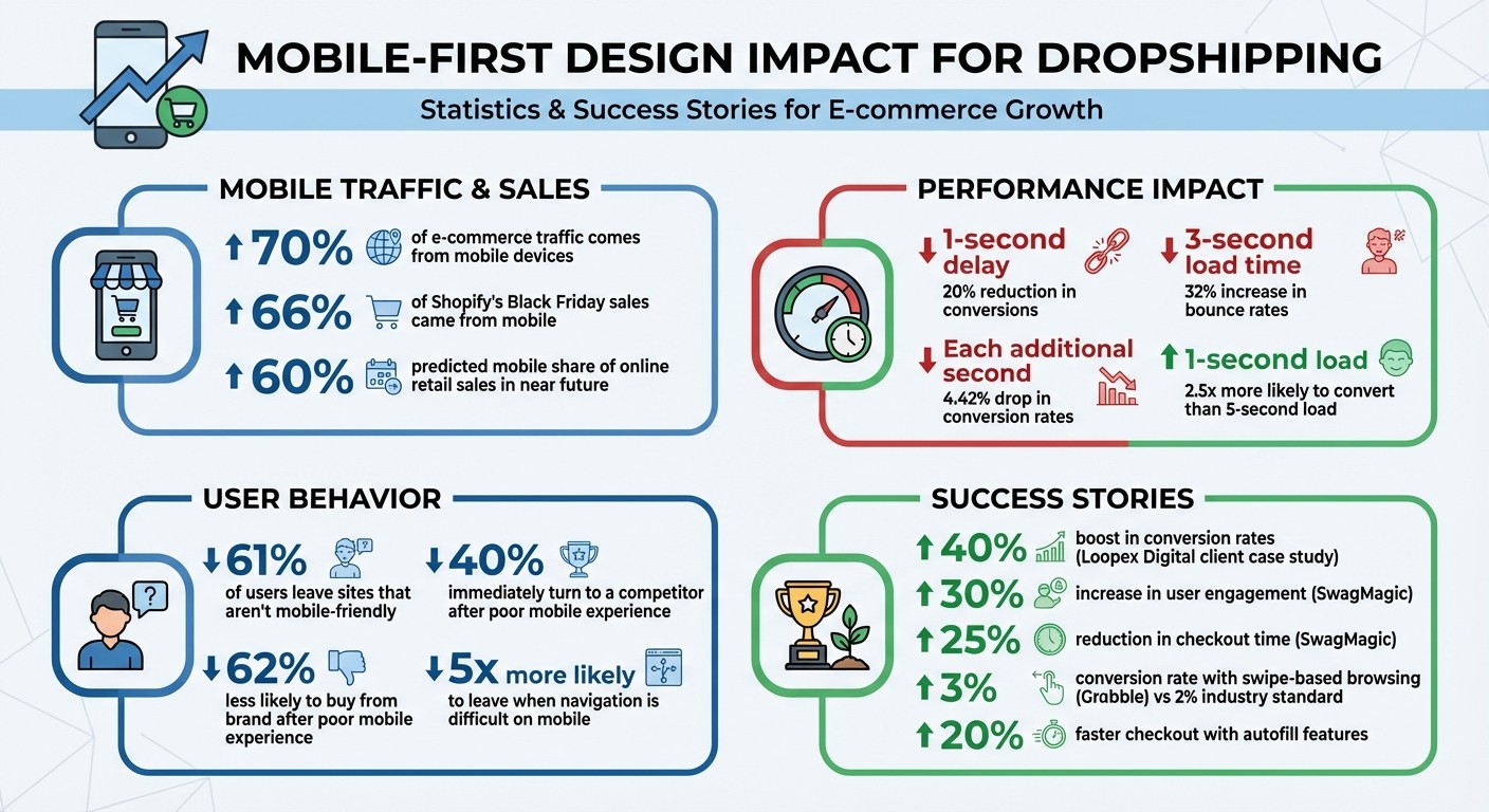
Mobile-First Design Impact on Dropshipping Sales Statistics
Ultimate Guide to Mobile Responsive Website Design (for Ecommerce)
Problems Dropshippers Face Without Mobile-First Design
If your dropshipping store isn’t designed with mobile users in mind, you’re likely facing some serious challenges that can hurt your sales and customer experience. These problems don’t just frustrate shoppers - they can also impact your store’s visibility on search engines.
High Bounce Rates and Abandoned Carts
When your website isn’t optimized for mobile, it shows in how users interact with it - and not in a good way. Many desktop-first designs rely on navigation bars and dropdown menus that work fine on larger screens but become a nightmare to use on smaller devices. In fact, users are five times more likely to leave a site when navigating it is difficult on their phones. Small buttons and links can also lead to mis-taps, where users either hit the wrong element or miss it entirely, causing frustration and quick exits.
Checkout can be another major pain point. Long forms and the need to manually enter credit card details on tiny mobile keyboards slow things down, pushing shoppers to abandon their carts. Without modern one-tap payment options like Apple Pay or Google Pay, the process becomes even more tedious, driving up cart abandonment rates. Add desktop-style pop-ups to the mix - those that block content on mobile screens - and you’ve got a recipe for unhappy users.
These design flaws don’t just irritate your customers - they also hurt your store’s search rankings.
Lower Search Rankings Due to Mobile-First Indexing
Google now uses mobile-first indexing, meaning it evaluates the mobile version of your site first when determining rankings. If your store isn’t mobile-friendly, Google may encounter a version with cluttered layouts, slow load times, or missing elements, all of which can drag your site down in search results. Considering that most Google searches happen on mobile devices, poor performance here means losing visibility where it matters most.
"Google uses mobile-first indexing, meaning when it crawls your site to decide when to show it in search results, it crawls the mobile version. A non-mobile-friendly website can rank lower, reducing organic traffic and visibility to potential customers."
Shopify Staff
Speed is another critical factor. Slow-loading mobile sites are penalized by search engines, which leads to fewer keyword rankings and less organic traffic. A real-world example? In 2023, Maria Harutyunyan from Loopex Digital revamped a client’s store to make it mobile-friendly. The result? A 40% boost in conversion rates and improved organic search rankings.
But it’s not just about SEO - poor mobile layouts also create a frustrating shopping experience.
Difficult Navigation and Checkout on Small Screens
When a store is designed for desktops, mobile users often find themselves pinching, zooming, and squinting to navigate. Buttons smaller than 48×48 pixels make accurate tapping a challenge, and features like dropdown menus or hover-based image zoom simply don’t work on touchscreens.
Even the layout can be a problem. Text blocks that look fine on a desktop monitor can overwhelm users on a smaller phone screen. Multi-column designs often force constant zooming and horizontal scrolling, adding to the frustration. It’s no surprise that 61% of shoppers will leave a site that isn’t mobile-friendly, and 40% of them will immediately turn to a competitor.
Without mobile-first design, you risk losing both visibility and customers.
How Mobile-First Design Fixes These Problems
Mobile-first design directly addresses common issues like slow load times, awkward navigation, and difficult checkout processes, turning customer frustrations into seamless shopping experiences. By designing for smartphones first and then adapting to larger screens, this approach tackles the root causes that often lead to abandoned carts and poor search rankings.
Responsive Layouts and Faster Loading Speeds
Responsive design relies on fluid grids, flexible images, and CSS media queries to automatically adjust your store’s layout for any screen size. This eliminates the need for pinching or horizontal scrolling. When customers can move effortlessly between their phone and desktop while shopping, they’re less likely to feel overwhelmed and more likely to complete their purchase.
Speed is just as crucial as layout. A site that loads in one second is 2.5 times more likely to convert than one that takes five seconds. Mobile-first design helps achieve this with techniques like lazy loading, which delays loading offscreen images so visible content appears almost instantly. The numbers speak for themselves: a three-second load time increases bounce rates by 32%, and every additional second cuts conversion rates by 4.42%.
"We saw a jump in our client's overall conversion rate by 40% over the previous year after implementing these changes [making the site responsive and optimizing images]." - Maria Harutyunyan, Co-founder, Loopex Digital
This combination of speed and adaptability also improves how users interact with your site.
Simplified Interfaces for Touch Screens
Mobile-first design focuses on thumb-friendly navigation, placing essential features like "Add to Cart" buttons within easy reach - typically in the middle or bottom of the screen where thumbs naturally rest. Interactive elements are designed to be at least 48×48 pixels, with a minimum of 8 pixels of spacing to prevent accidental taps.
On smaller screens, traditional desktop navigation is replaced with streamlined options like hamburger menus and collapsible submenus. Single-column layouts allow for smooth vertical scrolling, eliminating the need for horizontal swipes. Desktop hover effects are swapped for touch-friendly gestures, such as swiping through image galleries or tapping for product details. Grabble, a mobile commerce platform, adopted swipe-based browsing and achieved a 3% conversion rate, surpassing the 2% industry standard.
Streamlined Checkout for Mobile Buyers
With faster load times and simplified navigation, mobile-first design also optimizes the checkout process to reduce friction. Features like digital wallets (Apple Pay, Google Pay, Shop Pay) and guest checkout simplify the experience by enabling single-tap purchases or biometric authentication. Autofill and address autocomplete further speed up the process, cutting checkout time by 20%.
SwagMagic, led by co-founder Shaunak Amin, revamped its platform for mobile users in 2023. The results? A 30% increase in user engagement within three months and a 25% reduction in the time clients needed to complete their gifting process.
"Our clients reported a 25% decrease in the time taken to select and send gifts. And they said it was all due to the intuitive and responsive mobile interface." - Shaunak Amin, Co-founder and CEO, SwagMagic
How BuildMyStores Delivers Mobile-First Design
BuildMyStores tackles speed and navigation challenges head-on, embodying a mobile-first strategy that drives dropshipping success. This platform leverages AI to quickly create Shopify dropshipping stores that are ready for mobile users, removing the usual technical roadblocks. With over 100,000 stores already launched, you can bypass the drawn-out development phase and get your business up and running in just 5 to 10 minutes - no coding required.
AI-Built Themes Optimized for Mobile Conversions
The platform’s AI doesn’t just build stores; it crafts themes designed to convert mobile shoppers. These themes are tailored for smooth, hassle-free checkout experiences, ensuring they look polished on smaller screens. Each store is preloaded with 5–8 trending products, complete with AI-enhanced descriptions and professional-looking images. Plus, the themes are optimized for fast load times, reducing the risk of cart abandonment. The AI takes care of responsive layouts and touch-friendly navigation, making your store equally effective whether customers are shopping on their phones during a lunch break or on their laptops at home.
Fast Setup for Mobile-Ready Stores
Setting up a traditional store can take weeks of design and testing. BuildMyStores shrinks that timeline to under 10 minutes. The AI handles everything - initial setup, product selection, and mobile optimization - so you can start promoting your store almost immediately. eCommerce entrepreneur AC Hampton praised the process, saying:
"I've reviewed thousands of stores, and this setup is a winner. Pre-loaded with products that sell and are ready to scale from day one".
While you’ll need to cover Shopify’s subscription costs, the AI-built store itself is completely free.
Complete Ownership and Customization Control
Even though the store is AI-generated, you maintain full ownership and keep 100% of your revenue. Every aspect of the store is customizable, from branding to product listings. You can tweak call-to-action buttons to meet the ideal 48×48 pixel size for touchscreens, experiment with different mobile layouts, or even redesign entire sections - all while preserving the AI’s performance advantages. Since the platform is accessible worldwide, you can manage your dropshipping business from anywhere with an internet connection.
Conclusion
Stores that aren't optimized for mobile devices are leaving money on the table. With over 70% of global ecommerce traffic now coming from mobile devices, ignoring mobile-first design can lead to high bounce rates, abandoned carts, and poor search rankings. Since Google's mobile-first indexing prioritizes the mobile version of your site, failing to optimize could mean losing visibility altogether. Add to that the fact that 62% of users are less likely to buy from a brand after a poor mobile experience, and the need for mobile optimization becomes impossible to ignore.
A mobile-first design solves these issues by focusing on speed, user-friendly navigation, and a seamless checkout process. Mobile-optimized stores load faster, make it easier for users to tap through pages, and simplify payments with one-tap options. All of this directly boosts conversion rates and reduces bounce rates. As David Zhang, CEO of Kate Backdrop, put it:
"The best advice I can offer to other ecommerce merchants is not to neglect the mobile experience. Neglecting it can significantly impact sales... Be mobile-first".
These improvements aren't just theoretical - they deliver real results. And that's where BuildMyStores comes in. This platform eliminates the technical hurdles of mobile optimization by creating fully functional, mobile-ready Shopify dropshipping stores in just 5 to 10 minutes. With conversion-optimized themes and pre-loaded trending products, you get a head start without giving up control. Plus, there’s no revenue sharing, meaning you keep 100% of your earnings while customizing your store to fit your brand.
As mobile shopping continues to dominate ecommerce, mobile-friendly stores are set to capture the majority of online retail sales - predicted to hit 60% in the near future. Those who prioritize fast, frictionless mobile experiences are well-positioned to thrive, while those who don’t risk falling behind. With BuildMyStores taking care of the technical side, you can focus on growing your business and reaching this ever-expanding mobile audience.
FAQs
How does a mobile-first design help increase dropshipping sales?
A mobile-first design focuses on delivering a smooth, hassle-free shopping experience for smartphone users, which is crucial for boosting dropshipping sales. With around 70% of shoppers making purchases on mobile devices, having a design that supports easy navigation, fast loading speeds, and a streamlined checkout process can significantly lower bounce rates and increase conversions.
By prioritizing mobile users, you’re aligning with where most customers spend their time, offering an intuitive and enjoyable experience that encourages sales growth.
What makes a dropshipping store mobile-friendly and effective?
A dropshipping store built for mobile users prioritizes responsive design, quick load times, and an easy-to-navigate interface. The site layout should automatically adapt to different screen sizes, ensuring your products look polished and appealing on both smartphones and tablets. Speed is key here - compressing images and trimming unnecessary code can make pages load faster, keeping potential customers from bouncing away.
To make browsing and shopping a breeze, focus on thumb-friendly navigation. This means clear menus, large, easy-to-tap buttons, and a sticky "Add to Cart" feature that stays visible as users scroll. Simplifying the checkout process is equally important. Options like single-page checkouts and mobile payment methods such as Apple Pay or Google Pay can make the buying process smooth and hassle-free, increasing the chances of a completed purchase.
Leverage tools like AI-powered, mobile-optimized themes - offered by platforms like BuildMyStores - to take your store to the next level. These themes often include features like quick-view pop-ups and built-in analytics to fine-tune your store's performance. By focusing on a mobile-first design, you can effectively turn smartphone visitors into loyal customers.
How does Google’s mobile-first indexing impact my dropshipping store's visibility?
Google’s mobile-first indexing focuses on evaluating the mobile version of your website to determine its search rankings. If your site doesn’t perform well on mobile devices, it could lead to lower rankings, making it harder for potential customers to find you.
Having a mobile-friendly design ensures your store not only looks appealing but also works seamlessly on smartphones and tablets. Considering that most online shoppers use mobile devices to browse and buy, optimizing for mobile isn’t optional - it’s essential. It enhances the shopping experience, improves your search rankings, and can lead to higher sales.
Related Blog Posts
Your dropshipping store might be losing sales right now. Why? Because over 70% of e-commerce traffic comes from mobile devices, yet many stores fail to prioritize mobile users. Poor mobile design leads to abandoned carts, lower search rankings, and frustrated shoppers.
Here’s what you need to know:
Mobile drives sales: 66% of Shopify’s Black Friday sales came from mobile.
Google ranks mobile first: A slow or clunky mobile site can hurt your visibility.
Speed matters: A 1-second delay reduces conversions by 20%.
Bad navigation kills sales: 61% of users leave sites that aren’t mobile-friendly.
Mobile-first design solves these issues by focusing on fast load times, simple navigation, and touch-friendly layouts. Platforms like BuildMyStores make it easy to create mobile-ready Shopify stores in minutes, helping you tap into the growing mobile audience and boost sales.
Mobile-First Design Impact on Dropshipping Sales Statistics
Ultimate Guide to Mobile Responsive Website Design (for Ecommerce)
Problems Dropshippers Face Without Mobile-First Design
If your dropshipping store isn’t designed with mobile users in mind, you’re likely facing some serious challenges that can hurt your sales and customer experience. These problems don’t just frustrate shoppers - they can also impact your store’s visibility on search engines.
High Bounce Rates and Abandoned Carts
When your website isn’t optimized for mobile, it shows in how users interact with it - and not in a good way. Many desktop-first designs rely on navigation bars and dropdown menus that work fine on larger screens but become a nightmare to use on smaller devices. In fact, users are five times more likely to leave a site when navigating it is difficult on their phones. Small buttons and links can also lead to mis-taps, where users either hit the wrong element or miss it entirely, causing frustration and quick exits.
Checkout can be another major pain point. Long forms and the need to manually enter credit card details on tiny mobile keyboards slow things down, pushing shoppers to abandon their carts. Without modern one-tap payment options like Apple Pay or Google Pay, the process becomes even more tedious, driving up cart abandonment rates. Add desktop-style pop-ups to the mix - those that block content on mobile screens - and you’ve got a recipe for unhappy users.
These design flaws don’t just irritate your customers - they also hurt your store’s search rankings.
Lower Search Rankings Due to Mobile-First Indexing
Google now uses mobile-first indexing, meaning it evaluates the mobile version of your site first when determining rankings. If your store isn’t mobile-friendly, Google may encounter a version with cluttered layouts, slow load times, or missing elements, all of which can drag your site down in search results. Considering that most Google searches happen on mobile devices, poor performance here means losing visibility where it matters most.
"Google uses mobile-first indexing, meaning when it crawls your site to decide when to show it in search results, it crawls the mobile version. A non-mobile-friendly website can rank lower, reducing organic traffic and visibility to potential customers."
Shopify Staff
Speed is another critical factor. Slow-loading mobile sites are penalized by search engines, which leads to fewer keyword rankings and less organic traffic. A real-world example? In 2023, Maria Harutyunyan from Loopex Digital revamped a client’s store to make it mobile-friendly. The result? A 40% boost in conversion rates and improved organic search rankings.
But it’s not just about SEO - poor mobile layouts also create a frustrating shopping experience.
Difficult Navigation and Checkout on Small Screens
When a store is designed for desktops, mobile users often find themselves pinching, zooming, and squinting to navigate. Buttons smaller than 48×48 pixels make accurate tapping a challenge, and features like dropdown menus or hover-based image zoom simply don’t work on touchscreens.
Even the layout can be a problem. Text blocks that look fine on a desktop monitor can overwhelm users on a smaller phone screen. Multi-column designs often force constant zooming and horizontal scrolling, adding to the frustration. It’s no surprise that 61% of shoppers will leave a site that isn’t mobile-friendly, and 40% of them will immediately turn to a competitor.
Without mobile-first design, you risk losing both visibility and customers.
How Mobile-First Design Fixes These Problems
Mobile-first design directly addresses common issues like slow load times, awkward navigation, and difficult checkout processes, turning customer frustrations into seamless shopping experiences. By designing for smartphones first and then adapting to larger screens, this approach tackles the root causes that often lead to abandoned carts and poor search rankings.
Responsive Layouts and Faster Loading Speeds
Responsive design relies on fluid grids, flexible images, and CSS media queries to automatically adjust your store’s layout for any screen size. This eliminates the need for pinching or horizontal scrolling. When customers can move effortlessly between their phone and desktop while shopping, they’re less likely to feel overwhelmed and more likely to complete their purchase.
Speed is just as crucial as layout. A site that loads in one second is 2.5 times more likely to convert than one that takes five seconds. Mobile-first design helps achieve this with techniques like lazy loading, which delays loading offscreen images so visible content appears almost instantly. The numbers speak for themselves: a three-second load time increases bounce rates by 32%, and every additional second cuts conversion rates by 4.42%.
"We saw a jump in our client's overall conversion rate by 40% over the previous year after implementing these changes [making the site responsive and optimizing images]." - Maria Harutyunyan, Co-founder, Loopex Digital
This combination of speed and adaptability also improves how users interact with your site.
Simplified Interfaces for Touch Screens
Mobile-first design focuses on thumb-friendly navigation, placing essential features like "Add to Cart" buttons within easy reach - typically in the middle or bottom of the screen where thumbs naturally rest. Interactive elements are designed to be at least 48×48 pixels, with a minimum of 8 pixels of spacing to prevent accidental taps.
On smaller screens, traditional desktop navigation is replaced with streamlined options like hamburger menus and collapsible submenus. Single-column layouts allow for smooth vertical scrolling, eliminating the need for horizontal swipes. Desktop hover effects are swapped for touch-friendly gestures, such as swiping through image galleries or tapping for product details. Grabble, a mobile commerce platform, adopted swipe-based browsing and achieved a 3% conversion rate, surpassing the 2% industry standard.
Streamlined Checkout for Mobile Buyers
With faster load times and simplified navigation, mobile-first design also optimizes the checkout process to reduce friction. Features like digital wallets (Apple Pay, Google Pay, Shop Pay) and guest checkout simplify the experience by enabling single-tap purchases or biometric authentication. Autofill and address autocomplete further speed up the process, cutting checkout time by 20%.
SwagMagic, led by co-founder Shaunak Amin, revamped its platform for mobile users in 2023. The results? A 30% increase in user engagement within three months and a 25% reduction in the time clients needed to complete their gifting process.
"Our clients reported a 25% decrease in the time taken to select and send gifts. And they said it was all due to the intuitive and responsive mobile interface." - Shaunak Amin, Co-founder and CEO, SwagMagic
How BuildMyStores Delivers Mobile-First Design
BuildMyStores tackles speed and navigation challenges head-on, embodying a mobile-first strategy that drives dropshipping success. This platform leverages AI to quickly create Shopify dropshipping stores that are ready for mobile users, removing the usual technical roadblocks. With over 100,000 stores already launched, you can bypass the drawn-out development phase and get your business up and running in just 5 to 10 minutes - no coding required.
AI-Built Themes Optimized for Mobile Conversions
The platform’s AI doesn’t just build stores; it crafts themes designed to convert mobile shoppers. These themes are tailored for smooth, hassle-free checkout experiences, ensuring they look polished on smaller screens. Each store is preloaded with 5–8 trending products, complete with AI-enhanced descriptions and professional-looking images. Plus, the themes are optimized for fast load times, reducing the risk of cart abandonment. The AI takes care of responsive layouts and touch-friendly navigation, making your store equally effective whether customers are shopping on their phones during a lunch break or on their laptops at home.
Fast Setup for Mobile-Ready Stores
Setting up a traditional store can take weeks of design and testing. BuildMyStores shrinks that timeline to under 10 minutes. The AI handles everything - initial setup, product selection, and mobile optimization - so you can start promoting your store almost immediately. eCommerce entrepreneur AC Hampton praised the process, saying:
"I've reviewed thousands of stores, and this setup is a winner. Pre-loaded with products that sell and are ready to scale from day one".
While you’ll need to cover Shopify’s subscription costs, the AI-built store itself is completely free.
Complete Ownership and Customization Control
Even though the store is AI-generated, you maintain full ownership and keep 100% of your revenue. Every aspect of the store is customizable, from branding to product listings. You can tweak call-to-action buttons to meet the ideal 48×48 pixel size for touchscreens, experiment with different mobile layouts, or even redesign entire sections - all while preserving the AI’s performance advantages. Since the platform is accessible worldwide, you can manage your dropshipping business from anywhere with an internet connection.
Conclusion
Stores that aren't optimized for mobile devices are leaving money on the table. With over 70% of global ecommerce traffic now coming from mobile devices, ignoring mobile-first design can lead to high bounce rates, abandoned carts, and poor search rankings. Since Google's mobile-first indexing prioritizes the mobile version of your site, failing to optimize could mean losing visibility altogether. Add to that the fact that 62% of users are less likely to buy from a brand after a poor mobile experience, and the need for mobile optimization becomes impossible to ignore.
A mobile-first design solves these issues by focusing on speed, user-friendly navigation, and a seamless checkout process. Mobile-optimized stores load faster, make it easier for users to tap through pages, and simplify payments with one-tap options. All of this directly boosts conversion rates and reduces bounce rates. As David Zhang, CEO of Kate Backdrop, put it:
"The best advice I can offer to other ecommerce merchants is not to neglect the mobile experience. Neglecting it can significantly impact sales... Be mobile-first".
These improvements aren't just theoretical - they deliver real results. And that's where BuildMyStores comes in. This platform eliminates the technical hurdles of mobile optimization by creating fully functional, mobile-ready Shopify dropshipping stores in just 5 to 10 minutes. With conversion-optimized themes and pre-loaded trending products, you get a head start without giving up control. Plus, there’s no revenue sharing, meaning you keep 100% of your earnings while customizing your store to fit your brand.
As mobile shopping continues to dominate ecommerce, mobile-friendly stores are set to capture the majority of online retail sales - predicted to hit 60% in the near future. Those who prioritize fast, frictionless mobile experiences are well-positioned to thrive, while those who don’t risk falling behind. With BuildMyStores taking care of the technical side, you can focus on growing your business and reaching this ever-expanding mobile audience.
FAQs
How does a mobile-first design help increase dropshipping sales?
A mobile-first design focuses on delivering a smooth, hassle-free shopping experience for smartphone users, which is crucial for boosting dropshipping sales. With around 70% of shoppers making purchases on mobile devices, having a design that supports easy navigation, fast loading speeds, and a streamlined checkout process can significantly lower bounce rates and increase conversions.
By prioritizing mobile users, you’re aligning with where most customers spend their time, offering an intuitive and enjoyable experience that encourages sales growth.
What makes a dropshipping store mobile-friendly and effective?
A dropshipping store built for mobile users prioritizes responsive design, quick load times, and an easy-to-navigate interface. The site layout should automatically adapt to different screen sizes, ensuring your products look polished and appealing on both smartphones and tablets. Speed is key here - compressing images and trimming unnecessary code can make pages load faster, keeping potential customers from bouncing away.
To make browsing and shopping a breeze, focus on thumb-friendly navigation. This means clear menus, large, easy-to-tap buttons, and a sticky "Add to Cart" feature that stays visible as users scroll. Simplifying the checkout process is equally important. Options like single-page checkouts and mobile payment methods such as Apple Pay or Google Pay can make the buying process smooth and hassle-free, increasing the chances of a completed purchase.
Leverage tools like AI-powered, mobile-optimized themes - offered by platforms like BuildMyStores - to take your store to the next level. These themes often include features like quick-view pop-ups and built-in analytics to fine-tune your store's performance. By focusing on a mobile-first design, you can effectively turn smartphone visitors into loyal customers.
How does Google’s mobile-first indexing impact my dropshipping store's visibility?
Google’s mobile-first indexing focuses on evaluating the mobile version of your website to determine its search rankings. If your site doesn’t perform well on mobile devices, it could lead to lower rankings, making it harder for potential customers to find you.
Having a mobile-friendly design ensures your store not only looks appealing but also works seamlessly on smartphones and tablets. Considering that most online shoppers use mobile devices to browse and buy, optimizing for mobile isn’t optional - it’s essential. It enhances the shopping experience, improves your search rankings, and can lead to higher sales.
Related Blog Posts
Get your store!
© 2025 BuildMyStores
© 2025 BuildMyStores